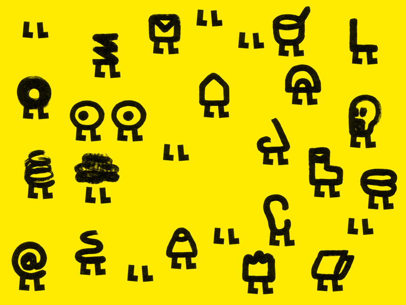
Pronomade(s)
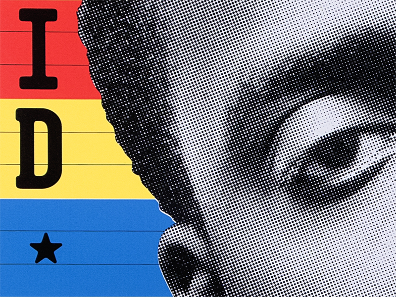
mai 2010 • Première collaboration avec Pronomades(s) en Haute-Garonne, Centre national (nomade) des arts de la rue. Nouvelle identité visuelle : des mots, du jaune fluo, une signature manuscrite et une famille de logos sur pattes. En collaboration avec Benoit Bonnemaison-Fitte //
First collaboration with Pronomade(s) en Haute-Garonne, a nomadic performing arts center in the south of France. New visual identity: words, fluorescent yellow, handwritten signature and a set of walking logos. In collaboration with Benoit Bonnemaison-Fitte.
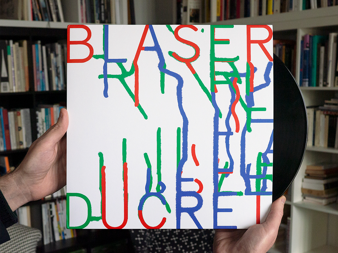
Voyageurs
décembre 2021 • Design du disque vinyle « Voyageurs » du duo Samuel Blaser / Marc Ducret pour le label Jazzdor Series //
Design of the LP record ”Voyageurs” by the duo Samuel Blaser/Marc Ducret for the Jazzdor Series label. +++
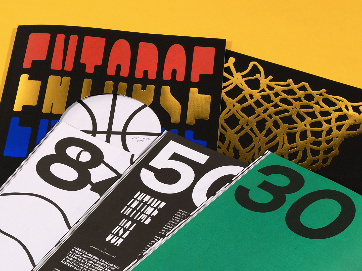
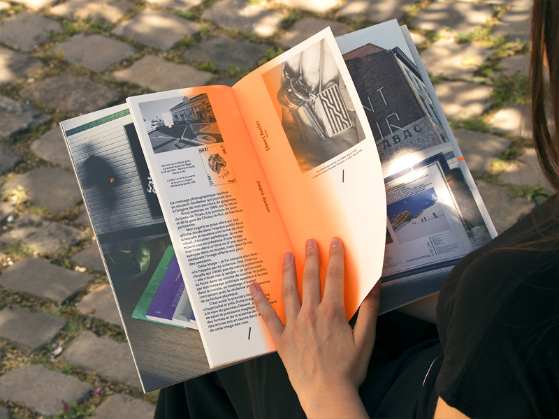
Entorse #2
mars 2019 • Conception éditoriale et design du deuxième numéro d’Entorse, revue sportive – mais pas trop – autour du basketball //
Editorial and graphic design of the second issue of Entorse, athletic –but not that much– magazine about basketball. +++
La République du vent
janvier 2026 • Couverture et portfolio du livre de Laurent Le Gall & Philippe Lagadec pour les éditions Anamosa //
Cover and portfolio of Laurent Le Gall & Philippe Lagadec’s book, published by Anamosa.
Lieu Unique 2016
juillet 2016 • Nous travaillons avec Nina Wehrle & Evelyne Laube (It’s Raining Elephants) pour les visuals de la saison 2016 du Lieu Unique à Nantes //
We work with Nina Wehrle & Evelyne Laube (It’s Raining Elephants) for the 2016 season posters of the Lieu Unique in Nantes.
Palais 24
novembre 2016 • Design du numéro 24 du magazine du Palais de Tokyo, consacré au « Lasco Project » (programme du Palais de Tokyo dédié aux arts urbains initié en 2012) et aux artistes dont le travail s’est développé dans la rue //
Design of issue 24 of the magazine of the Palais de Tokyo, devoted to the “Lasco Project” (the Palais de Tokyo’s programme dedicated to urban art initiated in 2012) and to artists whose work has been developed in the street.
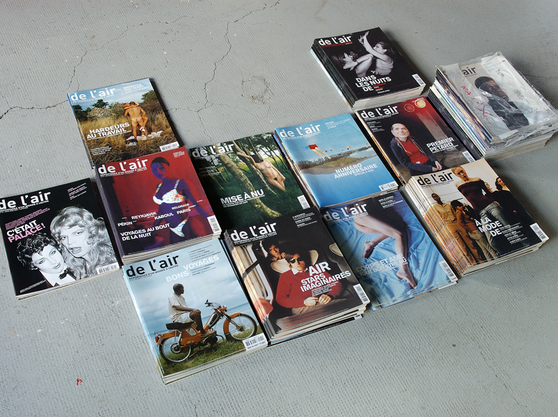
De l’air
2002-2003 • Direction artistique et graphisme du magazine de photo-reportage indépendant de l’air //
Art direction and design of the french independant photo report magazine de l’air.
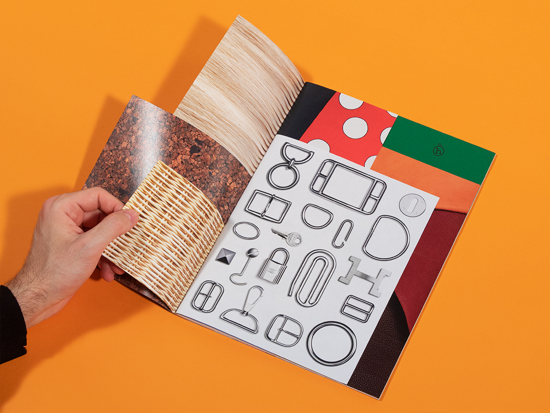
Petit h, Hermès
septembre 2019 • Dossier de presse de l’atelier petit h, laboratoire de « création à rebours » à partir des matières non utilisées par les manufactures Hermès //
Press kit for Atelier petit h, a laboratory for “creation in reverse” using materials not used by Hermès factories.
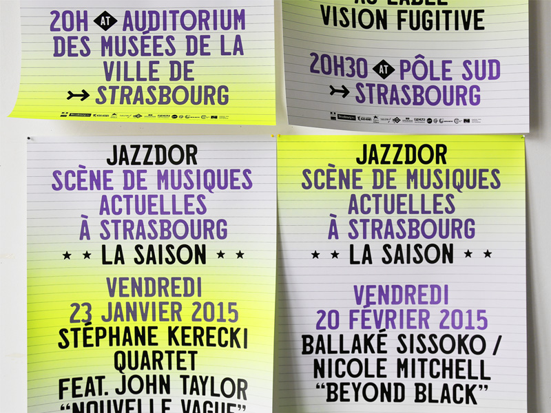
Jazzdor (SMAc)
septembre 2014 • Jazzdor, festival de jazz de Strasbourg depuis bientôt 30 ans, et dont nous nous occupons depuis 2002, vient d’être labellisé “SMAc” (Scène de Musiques Actuelles). Nouvelle identité typographique, affiches et programme pour la saison de concerts 2014/2015. Mise au point du caractère California Bold pour l’occasion, inspiré des plaques d’immatriculation californiennes //
Jazzdor, jazz festival in Strasbourg aging almost 30 years, for which we’ve been designing since 2002, has been just labelled “SMAc” (contemporary jazz music center). Design of the visual identity, posters and booklet of 2014/2015 concerts season. Type design of the font California Bold, inspired by californian car plates.
Jazzdor 2006
novembre 2006 • Série de photographies, affiches et programmes pour la 21e édition de Jazzdor, festival de Jazz de Strasbourg (Photographies de Christophe Urbain, Thomas Couderc et Clément Vauchez) //
Set of photographs, posters and booklets of the 21th Jazzdor, jazz festival in Strasbourg (Photographs by Christophe Urbain, Thomas Couderc and Clément Vauchez)
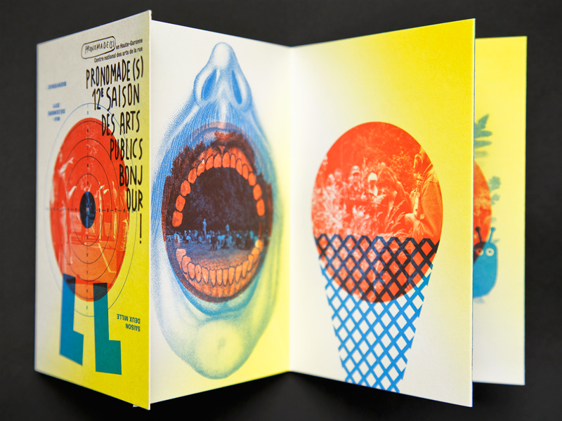
Pronomade(s) 2011
mai 2011 • Images, affiches, dépliant et cahiers pour la 12e saison de Pronomade(s) en Haute-Garonne. Cette série d’images est conçue à partir de photographies du public de Pronomade(s) en situation. En collaboration avec Benoit Bonnemaison-Fitte et François Serveau //
Pictures, posters, leaflet and booklets of Pronomade(s) en Haute-Garonne, 12th edition. Set of pictures based on photographs of various Pronomade(s) audience situations. In collaboration with Benoit Bonnemaison-Fitte and François Serveau.
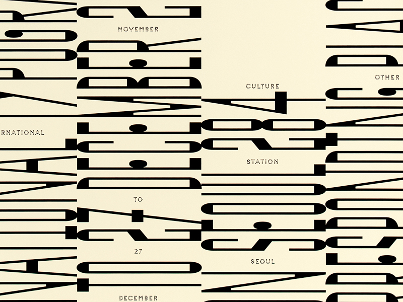
Typography and the City
mars 2015 • Identité visuelle et affiches de la Biennale Typojanchi 2015 à Séoul, consacrée aux relations entre ville et typographie //
Visual identity and posters of Typojanchi 2015 Biennial in Seoul, devoted to relations between city and typography.
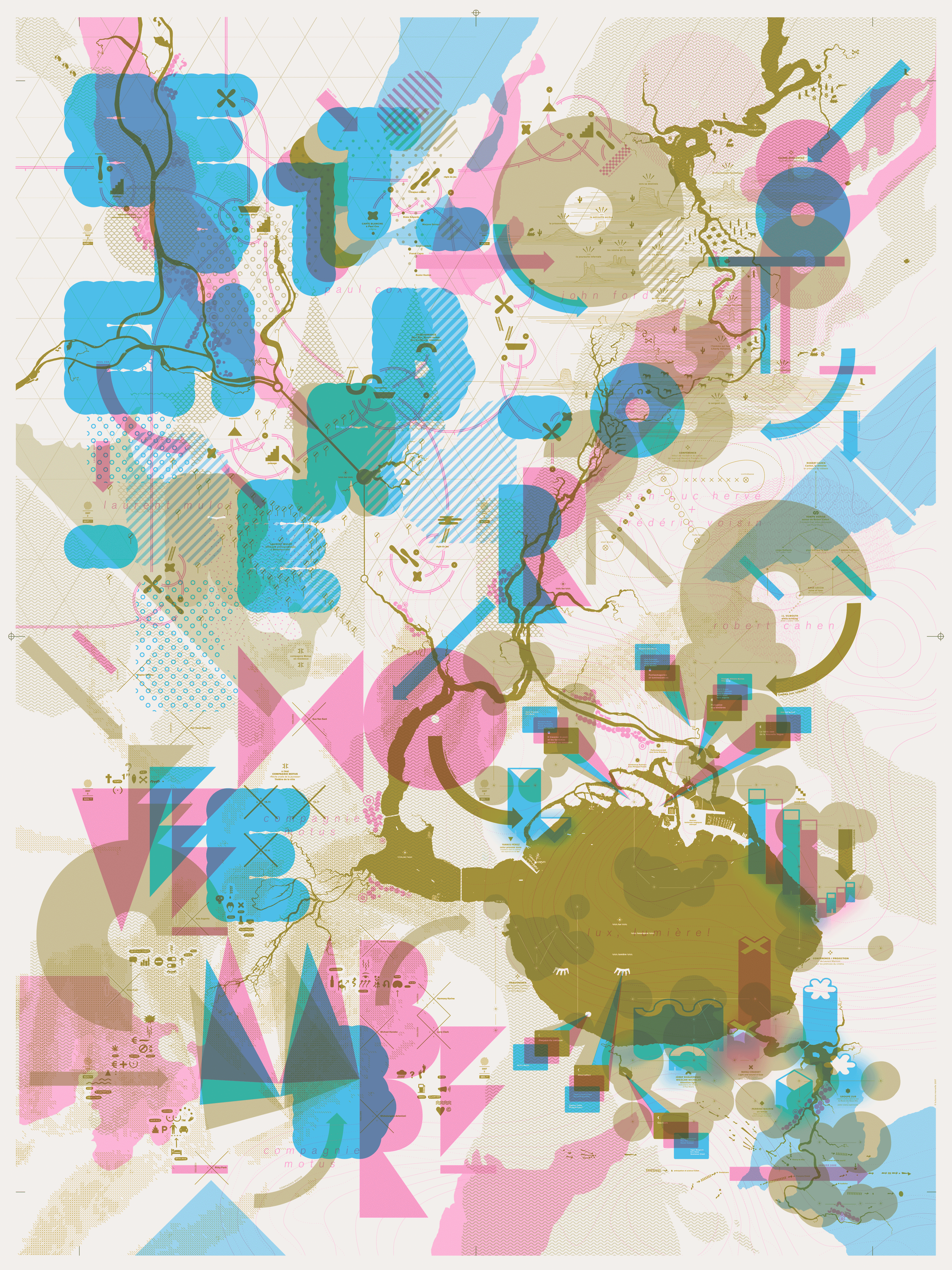
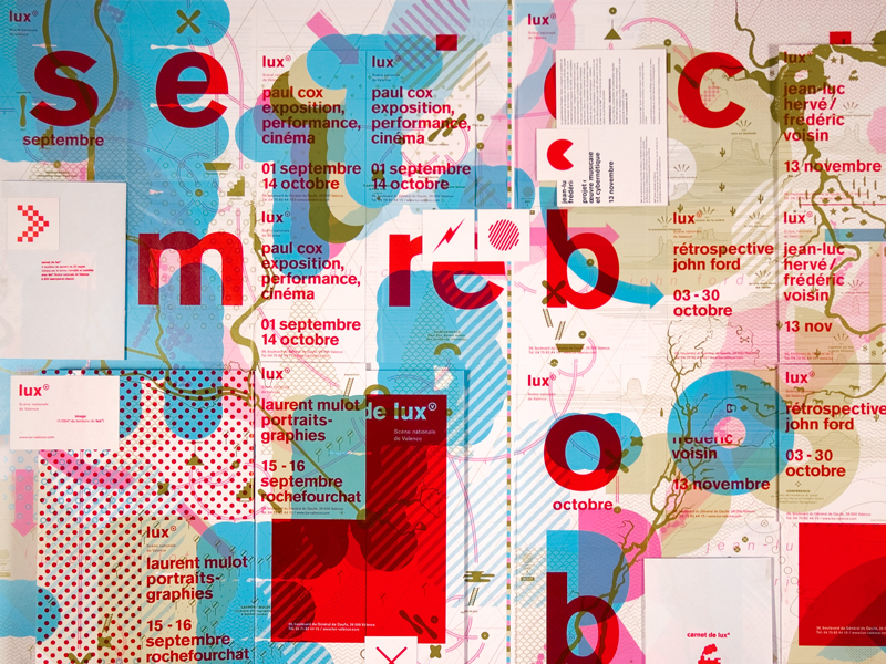
Lux 2/2
septembre 2007 • À l’invitation de Jérôme Delormas, nouveau directeur de Lux, scène nationale de Valence, nous cartographions l’ensemble de l’identité visuelle de la saison 2007. Deuxième partie de saison (septembre-décembre), deuxième carte //
Commissioned by Jérôme Delormas, the new Lux director, art center in Valence, we map/design the 2007 season visual identity. Second part of the season (september-december), second cartography. +++
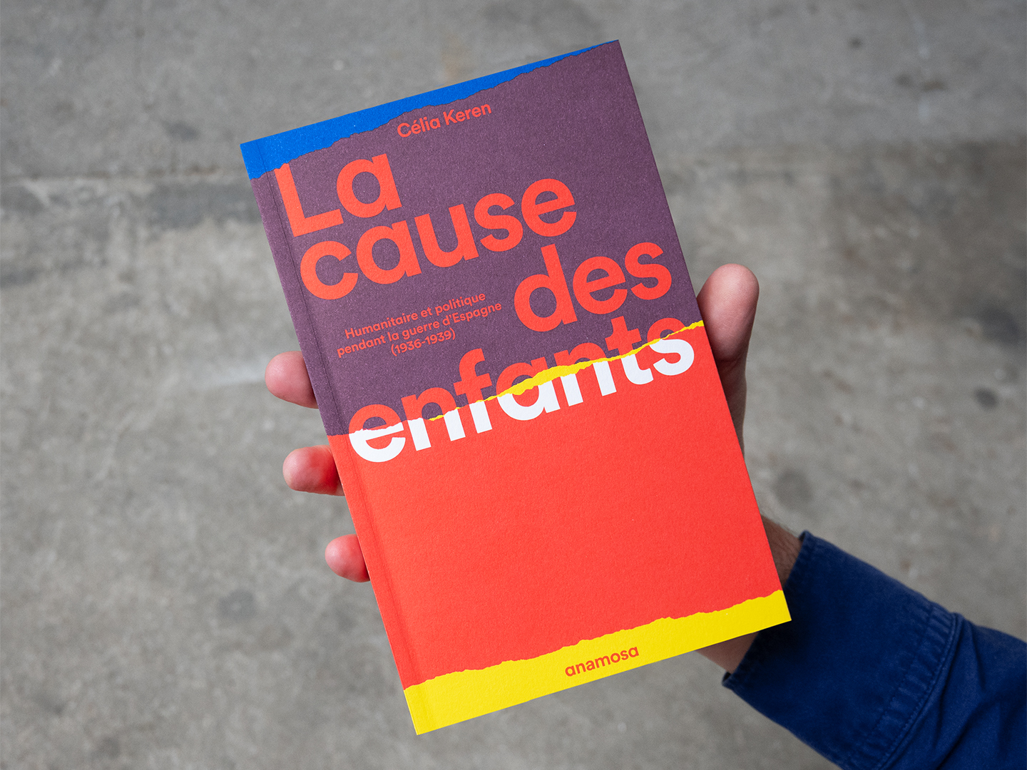
La cause des enfants
septembre 2025 • Couverture du livre de Célia Keren pour les éditions Anamosa //
Cover of Célia Keren’s book, published by Anamosa.
Jazzdor, la saison 2016/2017
septembre 2016 • Affiches des concerts de la Saison Jazzdor à Strasbourg //
Posters of the Jazzdor season concerts in Strasbourg.
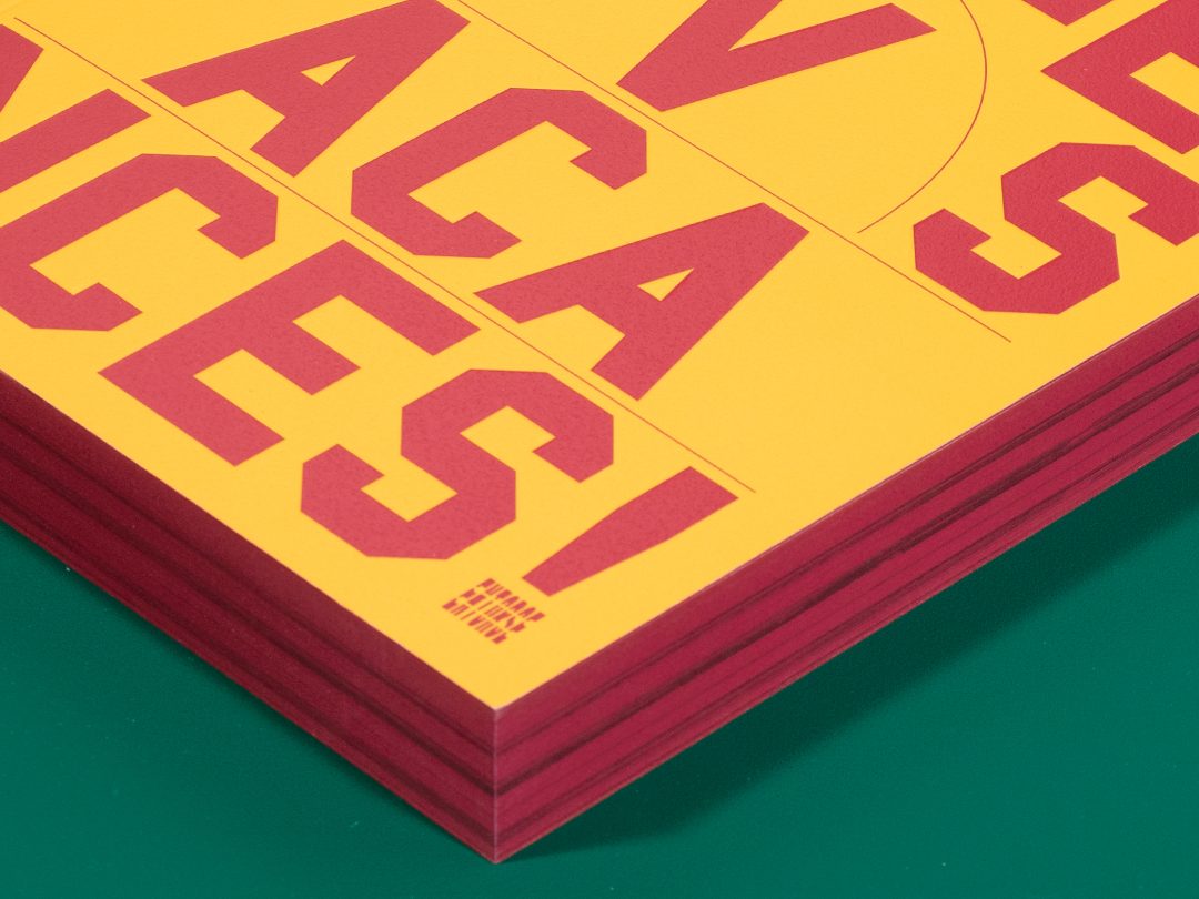
Bonnes vacances !
juillet 2020 • Design du livre de François Chevalier et Jérémy le Bescont sur la trilogie victorieuse du CSP Limoges en 2000 //
Design of the book by François Chevalier and Jérémy le Bescont on CSP Limoges’ victorious trilogy in 2000. +++
AGI France
décembre 2015 • Avec Frédéric Teschner, nous concevons la publication accompagnant la journée de conférences de l’Alliance Graphique Internationale France au théâtre de la Colline //
Together with Frédéric Teschner, we design the publication on the occasion of the Alliance Graphique Internationale conference day at théâtre de la Colline, Paris.
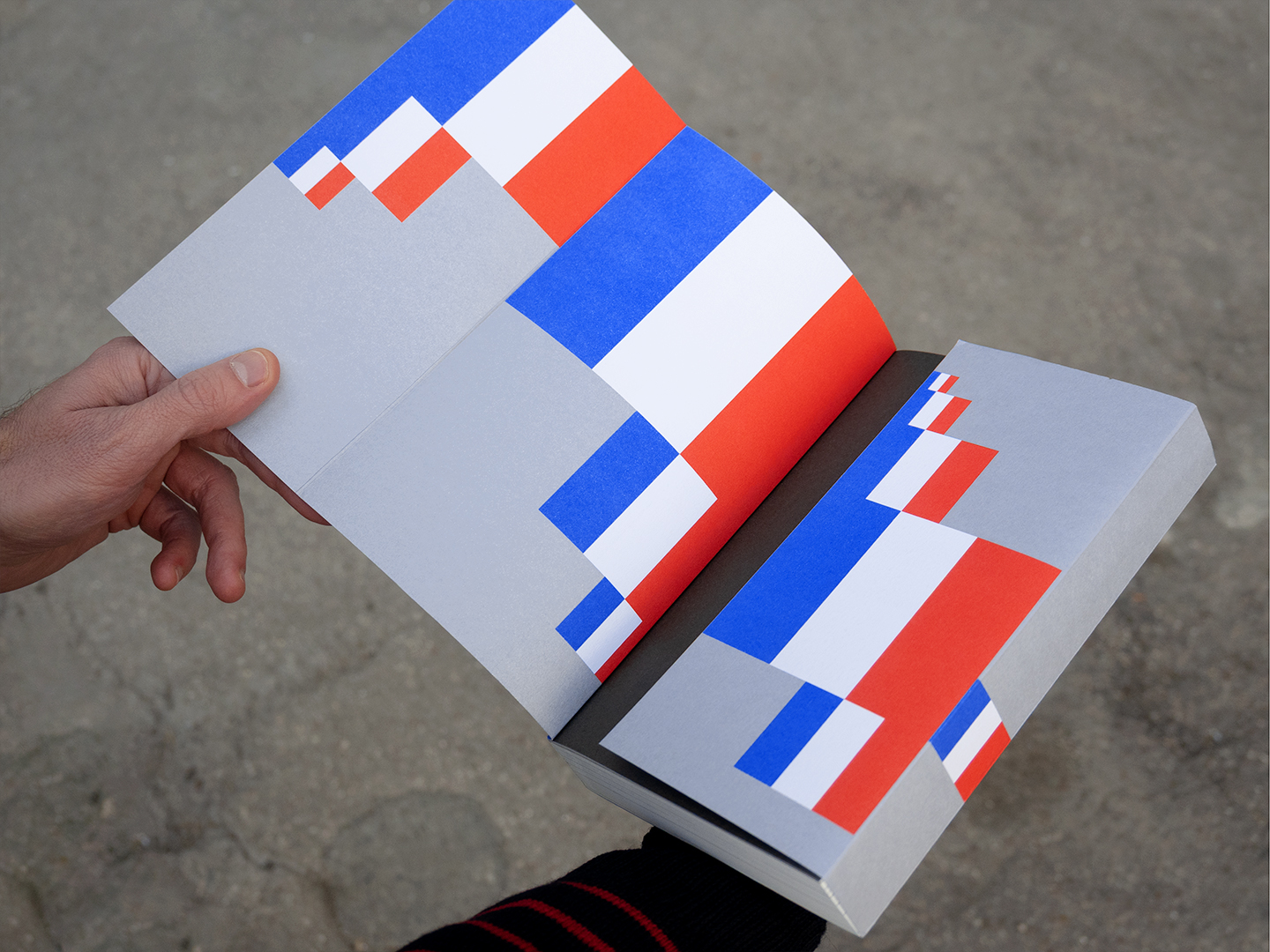
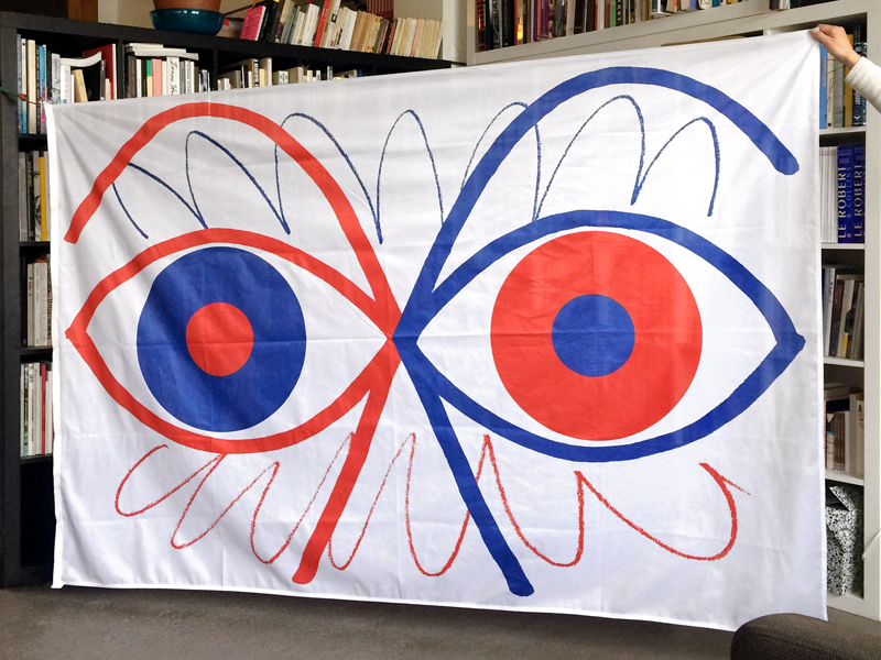
Freedom Flag
octobre 2017 • Création d’un drapeau pour la Chapelle des Calvairiennes dans le cadre de la Nuit Blanche Mayenne //
Flag creation for Chapelle des Calvairiennes on the occasion of Nuit Blanche Mayenne.
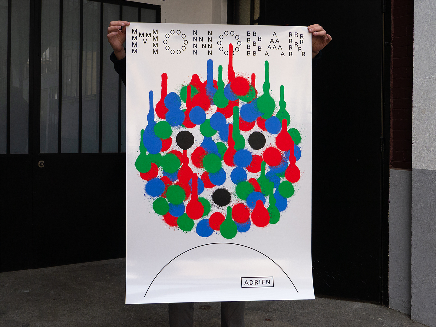
Monobar
novembre 2022 • Logo et diptyque d’affiches pour MONOBAR, le nouveau comptoir monoproduit du chef Adrien Cachot au Food Society Paris Gaité //
Logo and poster diptych for MONOBAR, chef Adrien Cachot’s new monoproduct counter at Food Society Paris Gaité.
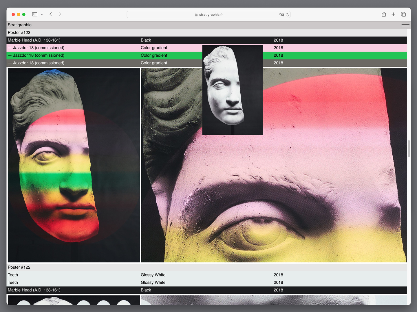
Stratigraphie.fr
septembre 2022 • stratigraphie.fr, site internet-archive de notre projet Stratigraphie //
stratigraphie.fr, website-archive of our project Stratigraphie. +++