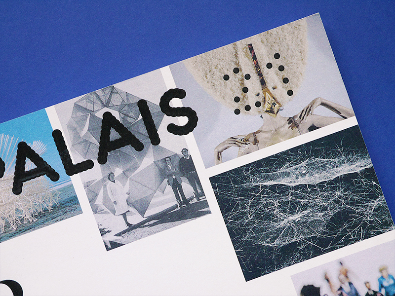
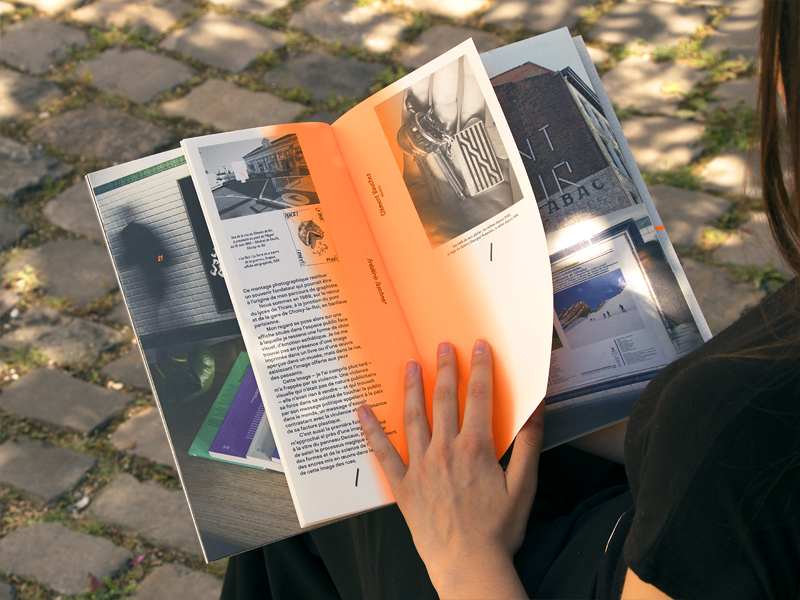
Palais 21
février 2015 • Design du numéro 21 du magazine du Palais de Tokyo, intégralement consacré à l’exposition « Le Bord des mondes », qui explore des territoires extérieurs au monde de l’art, en débusquant des gestes singuliers à l’origine de formes nouvelles de création //
Design of issue 21 of the magazine of the Palais de Tokyo, entirely devoted to the exhibition “At the Edge of the Worlds”, exploring territories that lie outside the art world and bringing to light unique gestures that give way to new forms of creation.
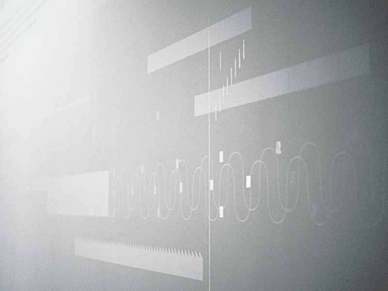
Sons & Lumières
septembre 2004 • Signalétique / mise en scène graphique de l’exposition Sons & Lumières, une histoire du son dans l’art du XXe siècle, au Centre Pompidou à Paris //
Signage / graphic staging of the exhibition Sons & Lumières, an history of sound in the 20th century in art, at Centre Pompidou, Paris.
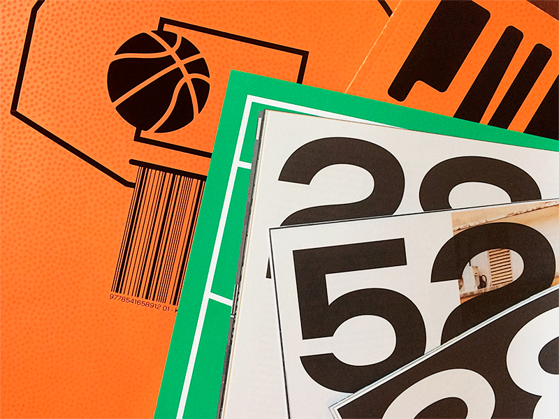
Entorse #1
décembre 2017 • Conception éditoriale et design du premier numéro d’Entorse, revue sportive – mais pas trop – autour du basketball //
Editorial and graphic design of the first issue of Entorse, athletic –but not that much– magazine about basketball. +++
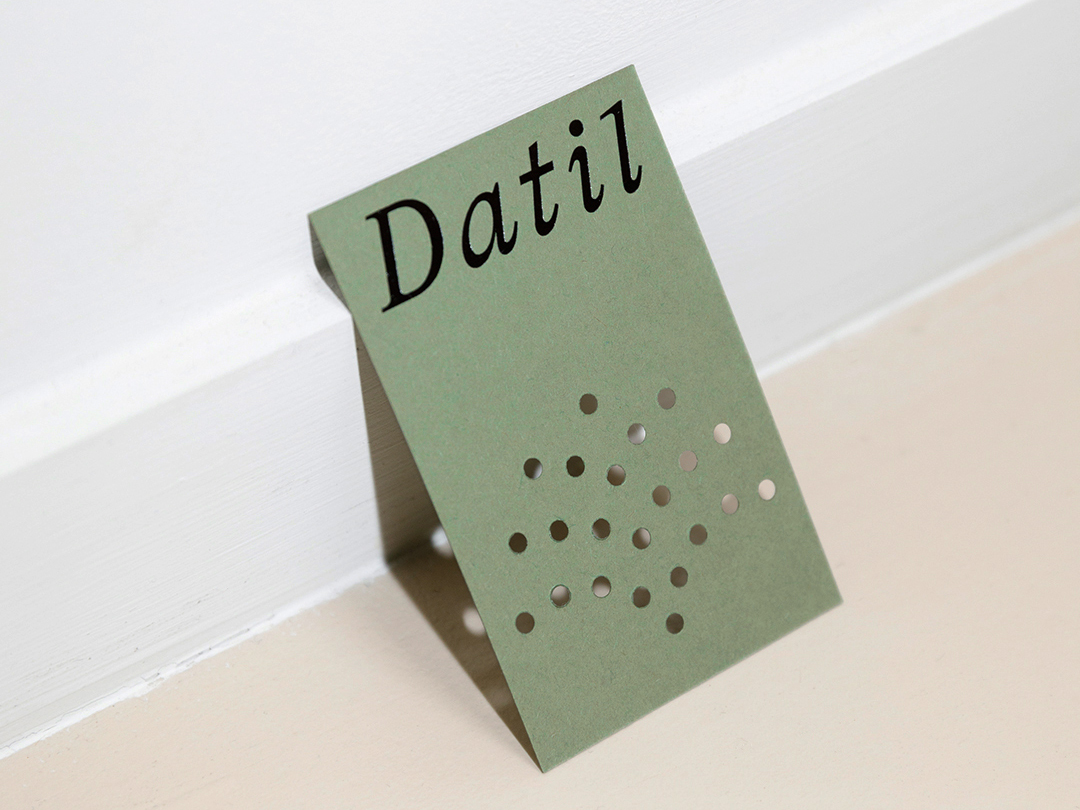
Datil
octobre 2023 • Identité visuelle de Datil, le nouveau restaurant des cheffes Manon Fleury et Laurène Barjhoux //
Visual identity for Datil, the new restaurant run by chefs Manon Fleury and Laurène Barjhoux. +++
Palais 20
octobre 2014 • Design du numéro 20 de Palais, le magazine du Palais de Tokyo //
Design of Issue 20 of Palais, the magazine of Palais de Tokyo.
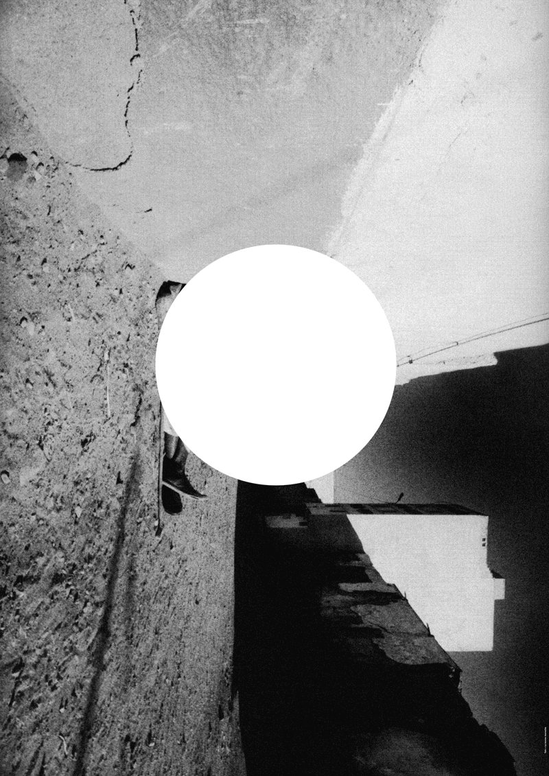
Cercle monochromatique
novembre 2006 • Affiche conçue à partir d’une photographie de Tshi Zerbia, pour l’exposition collective 80 + 80 (80 photographes + 80 graphistes) organisée par la Galerie Anatome et l’Agence VU //
Poster design from a photo by Tshi Zerbia, for the collective exhibition 80 + 80 (80 photographers + 80 graphic designers) curated by Galerie Anatome and Agence VU, Paris.
Jazzdor Strasbourg 2022
novembre 2022 • Affiche pour la 37e édition du festival Jazzdor à Strasbourg et programme annuel de la Saison //
Poster for the 37th edition of the Jazzdor festival in Strasbourg and annual program for the season.

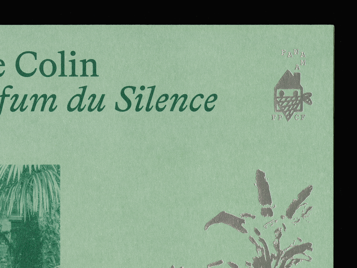
Bonnie Colin, Le Parfum du Silence
novembre 2024 • Conception éditoriale et design de la nouvelle collection de livres monographiques des Éditions FP&CF //
Editorial concept and design for the new collection of monographic books published by FP&CF. +++
AGI France
décembre 2015 • Avec Frédéric Teschner, nous concevons la publication accompagnant la journée de conférences de l’Alliance Graphique Internationale France au théâtre de la Colline //
Together with Frédéric Teschner, we design the publication on the occasion of the Alliance Graphique Internationale conference day at théâtre de la Colline, Paris.
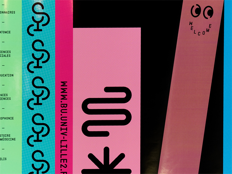
BU Lille 2
septembre 2016 • Identité visuelle, logo, typographies et affiches pour les Bibliothèques Universitaires Lille 2 //
Visual Identitiy, logo, type design and posters for University libraries in Lille.
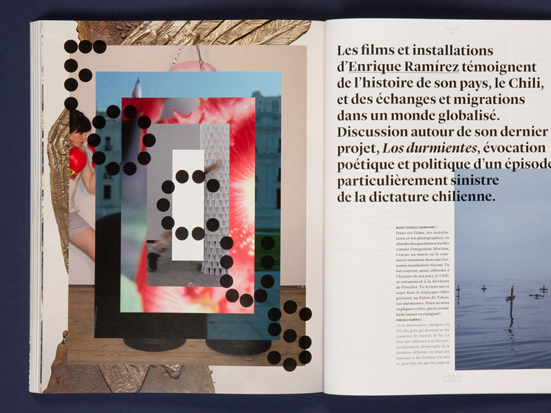
Palais 29
juillet 2019 • Design du numéro 29 du magazine du Palais de Tokyo, consacré intégralement à l’exposition « Prince·ss·e·s des villes » qui rassemble les créations d’une cinquantaine d’artistes en provenance de Dacca, Lagos, Manille, Mexico et Téhéran //
Design of issue 29 of the Palais de Tokyo magazine, devoted entirely to the exhibition “Prince·ss·e·s des villes” (Princes·ss·es of the Cities), which brings together the creations of some fifty artists from Dhaka, Lagos, Manila, Mexico City, and Tehran.
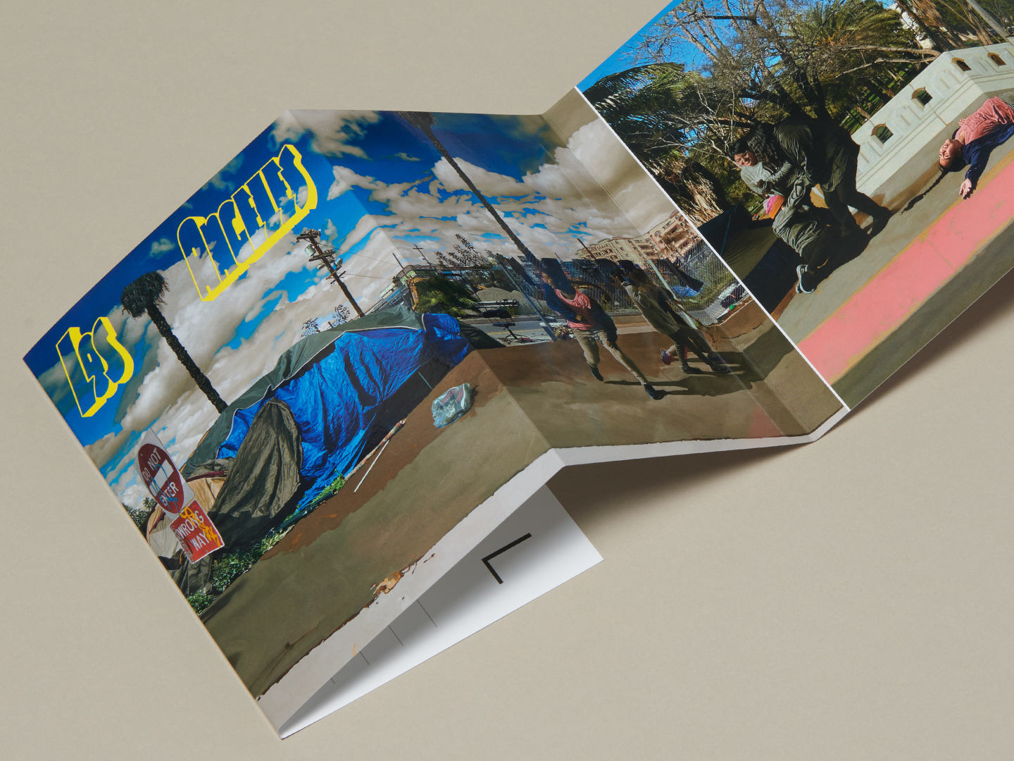
Los Angeles
septembre 2022 • « Los Angeles » du peintre Guillaume Bresson est un leporello de 1664 mm en guise de mini catalogue pour son exposition sur le stand de la Galerie Obadia durant la New York’s Art Fair 2022 //
“Los Angeles” by painter Guillaume Bresson is a 65 inches leporello serving as a mini catalogue for his solo exhibition at the Obadia Gallery booth during New York’s Art Fair 2022.
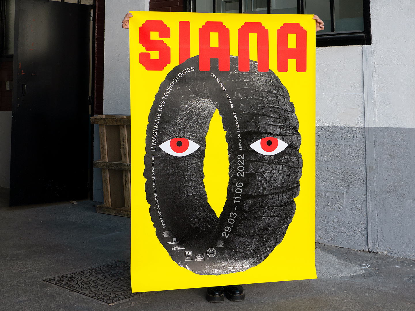
Siana 2022
mars 2022 • Affiche pour Siana, Biennale des arts numériques et alternatifs à Évry. Cette édition explore la manière dont les artistes et les scientifiques interrogent les futurs plus ou moins désirables de l’humanité //
Poster for Siana, digital and alternative art biennial in Évry. This edition explores how artists and scientists examine humanity’s more or less desirable futures.
Un printemps incertain
mai 2021 • Acquisition et exposition d’une série de 5 affiches de notre série « Stratigraphie » au Musée des Arts Décoratifs (MAD) //
Acquisition and exhibition of a series of five posters from our “Stratigraphie” series at the Musée des Arts Décoratifs (MAD), Paris.
Lieu Unique 2015
juillet 2015 • Un récit exploratoire en 4 affiches pour la nouvelle saison du Lieu Unique à Nantes, mis en images par Simon Roussin //
A 4 posters exploratory story for the up coming season of Lieu Unique in Nantes, with drawings by Simon Roussin.
Par monts et par vaux
octobre 2023 • Couverture du livre de Martin de la Soudière pour les éditions Anamosa //
Cover of Martin de la Soudière’s book, published by Anamosa.

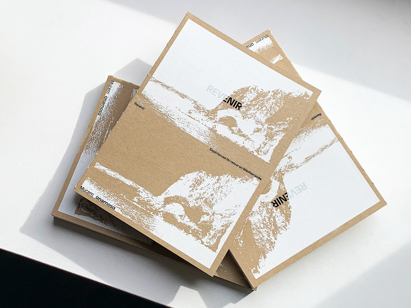
Revenir, expériences du retour en Méditerranée
octobre 2024 • Conception éditoriale et design du catalogue de l’exposition « Revenir » au Mucem, une coédition Anamosa / éditions du Mucem. En collaboration avec Loïc Altaber //
Editorial concept and design of the catalog for the exhibition “Revenir” at the Mucem, co-published by Anamosa and Mucem. In collaboration with Loïc Altaber
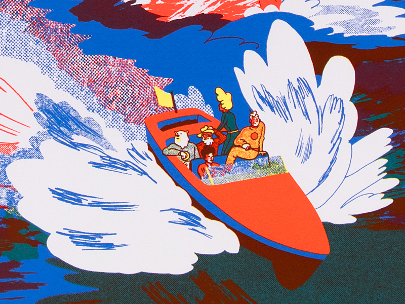
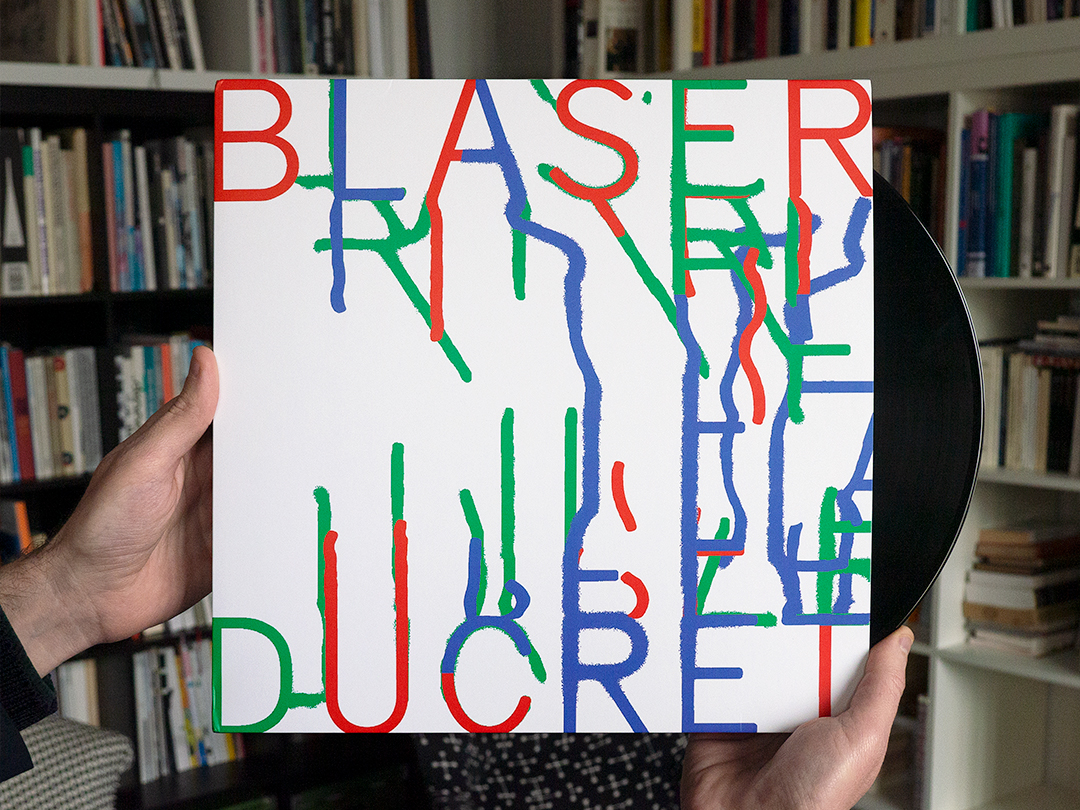
Voyageurs
décembre 2021 • Design du disque vinyle « Voyageurs » du duo Samuel Blaser / Marc Ducret pour le label Jazzdor Series //
Design of the LP record ”Voyageurs” by the duo Samuel Blaser/Marc Ducret for the Jazzdor Series label. +++
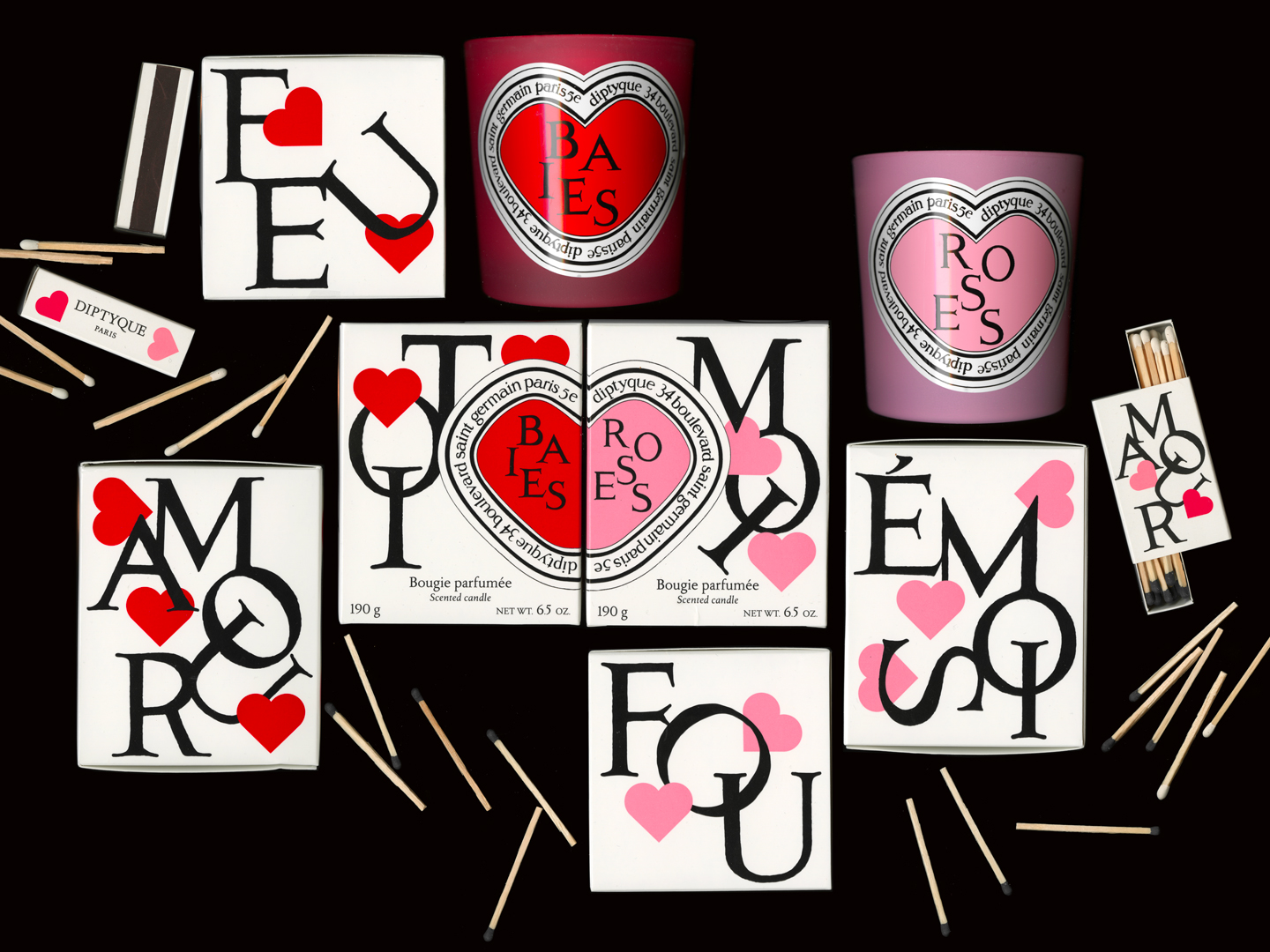
Love Love
février 2025 • Duo d’étuis de bougies Diptyque pour la Saint-Valentin //
Diptyque Valentine’s Day candle case duo.
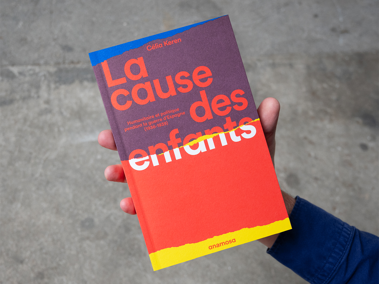
La cause des enfants
septembre 2025 • Couverture du livre de Célia Keren pour les éditions Anamosa //
Cover of Célia Keren’s book, published by Anamosa.